The site and the engineering goals
ThreeZero is a marketing and web development agency with a visual homepage and service pages. Its engineering challenge was to preserve the brand's black-and-magenta visual direction without making mobile visitors fight a navigation drawer, excessive overlays, a slow media interaction or a contact bar covering the first screen.
In the repository, the Phase 2 public-experience pull request records changes to mobile navigation, responsive CSS, service CMS sections, page hydration, background media and browser smoke tests. This article documents those implementation decisions and the checks used to validate them. It does not claim a measured speed increase or that the production deployment matched every staging test.
Change one: make mobile navigation reliable
The previous mobile approach used a narrower side drawer, while the requested design was a full-screen overlay. The implementation introduced a hamburger-to-close transition, modal accessibility attributes, body scroll lock, Escape handling, outside-area closure, keyboard focus cycling and responsive state reset.
A no-JavaScript fallback keeps navigation links reachable if the module fails to initialize. This matters because a visually impressive menu that cannot be opened or closed by keyboard is not a useful customer experience. The browser QA checks common small-phone and tablet widths, not only a desktop design preview.
Accessibility should be verified with a keyboard and assistive technology, not assumed from ARIA attributes alone. For a production release, test with the actual screen reader and browser combinations used by customers where possible.
Change two: avoid redundant page repainting
The server-side renderer can provide published CMS content in the initial HTML. Re-fetching the same data on first load can repaint hero text, work cards and service media after the visitor has already seen them. Phase 2 added logic to skip that duplicate hydration on pages marked as server-rendered, while preserving a fallback for static page delivery.
The optimization goal is predictable first paint and less redundant work. It does not prove a specific LCP result. A complete audit should still inspect response time, critical fonts, hero media discovery, CSS behavior, long tasks and layout shifts under realistic network conditions.
For service pages, duplicate empty CMS titles were removed and optional media sections made conditional. The AEO service-page before-and-after explains that source change in detail.
Change three: keep background media from dominating the interaction
Video can provide atmosphere, but it needs a reliable poster, acceptable file size, a stable aspect ratio and a way to pause when it is no longer relevant. The updated code checks document visibility, pauses videos in hidden browser tabs and preserves reduced-motion behavior. An error fallback prevents a missing video from covering the intended poster or gradient with a broken element.
For genuine performance work, inspect network size, compression, autoplay restrictions and whether a mobile-specific asset is really necessary. Do not eagerly download decorative video ahead of critical content without testing. A CSS overlay or animation should not make readable content blurry, and video should never interfere with the form.
Change four: protect the mobile conversion path
Fixed Call and WhatsApp actions can help a visitor contact the business after exploring a service. They can also cover the first screen, particularly when the hero contains its own scroll action. Phase 2 adjusted the mobile contact bar to appear after the hero rather than immediately obscuring the first-screen content and to disappear while the full-screen menu is open.
The browser workflow checks whether the bar reveals and hides with scrolling and menu state. It also validates that the desktop navigation does not display a mobile-only WhatsApp link. A click on these buttons is still only a contact attempt; successful delivery and qualified customer outcomes require separate tracking.
The actual test matrix versus Google Core Web Vitals
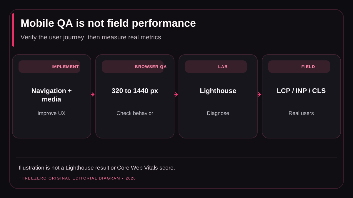
The Phase 3 Chromium integration run logged 104 successful responsive checks across the original site workflows, including viewport widths 320, 375, 390, 430, 768, 1024 and 1440 pixels. That is evidence of tested interactions and layout conditions in the controlled environment. It is not evidence of field LCP, INP or CLS improvements.
For web performance, Google describes good Core Web Vitals as Largest Contentful Paint of 2.5 seconds or less, Interaction to Next Paint of 200 milliseconds or less, and Cumulative Layout Shift of 0.1 or less, evaluated using appropriate real-user data. Consult Google's Core Web Vitals documentation and PageSpeed Insights methodology.
| What is checked? | Evidence | What remains unknown? |
|---|---|---|
| Responsive menu and overlays | Chromium QA | All real browser/assistive-tech combinations |
| Basic page rendering | Repository contracts and browser tests | Network-dependent production timing |
| LCP, INP, CLS | Google target definitions | Verified before/after field measurements |
| Qualified enquiries | Not in responsive QA | Production form and call attribution |
How a small business should validate its own redesign
- Capture a reproducible before state and retain the exact URL and device settings.
- Validate critical paths, navigation, call links, forms and keyboard interaction at multiple widths.
- Run PageSpeed Insights and Lighthouse for lab diagnostics without treating the lab score as field data.
- Review the Core Web Vitals report and CrUX when there are enough real-user samples.
- Measure response times, compressed assets, lazy loading and page shifts after release.
- Monitor the same organic landing pages and conversions without claiming causality from one change.
Fast, stable pages matter because they serve people. They do not guarantee Google rankings: Google's page-experience guidance explicitly places performance within a broader quality picture. For an engineering review, see website development or ask ThreeZero about a project.